The seconds hand sits where a numeral might otherwise command the space. On the Chronomètre Bleu, that small displacement is a useful invitation to look again. The watch tells the time with hours, minutes, and seconds, yet its face is not the inevitable arrangement of those three things. Someone made choices.
Understanding the Bleu begins with those choices. Why give so much attention to a watch whose display is comparatively simple? Because a reduced set of elements leaves each one with more work to do. The position of the seconds, the shape of the numerals, the relationship between the case and the dial: there is little to distract us from the composition.
Read the dial before reading the reputation
F.P. Journe describes the watch with a chrome blue dial, ivory-colored hands, and small seconds at approximately 7:30. The standard model's case is tantalum and measures 39 millimeters across. These are useful identifying facts, rather than a verdict on how it will wear. [1]
Start by considering the seconds display as part of the whole. Its position draws attention toward the lower left. Follow that pull, then look back toward the center and the signature. Does the arrangement seem settled, or slightly restless? That is a visual judgment you can make without knowing the price or memorizing the reference.
Next consider the numerals. Their role is practical, but their outlines and spacing also help establish the watch's character. Covering the brand name in a photograph is a worthwhile exercise: which features still make the design recognizable?
A photograph, however, offers only one set of lighting conditions. When examining the actual watch, ask to see it in ordinary light as well as under the lighting used to present it. Notice whether the hands remain easy for you to find as the angle changes. A beautiful image and a legible watch are related accomplishments, but they require different judgments.
The attraction of a dial is personal. The ability to explain what attracts you makes that preference more useful, both to yourself and to someone with different taste.
Why tantalum changes the conversation
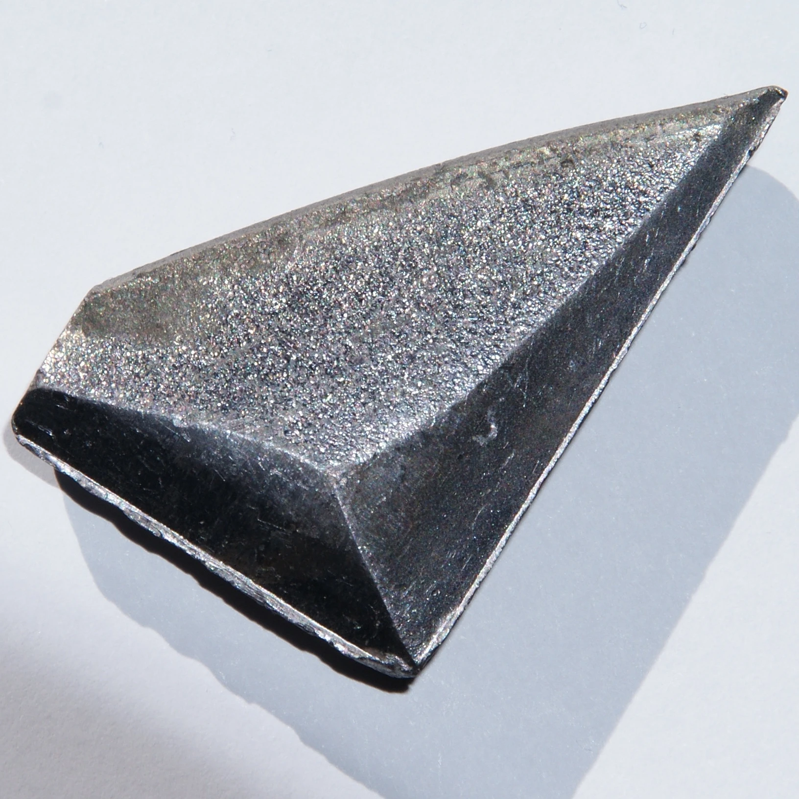
Tantalum is a chemical element, not a trade name for a shade of steel. The Royal Society of Chemistry describes it as a dense, corrosion-resistant metal. [2]
Those properties require careful translation into watch language. Density concerns mass for a given volume. It does not tell us the complete weight of a finished watch, because the dimensions and the rest of the construction also matter. Corrosion resistance does not mean that a polished surface cannot pick up scratches.
The most useful consequence for a prospective wearer is a question: does this particular combination of size, mass, strap, and case shape suit you? A diameter on a website cannot answer it. Neither can someone else's enthusiasm for weight as a sign of quality.
Tantalum also gives the designer a material with its own appearance. Looking at case and dial together is more revealing than treating “blue” as the watch's single defining feature. Ask how the surrounding metal changes your perception of the face. The watch is a composition of surfaces, including the narrow ones that photographs can make easy to overlook.
A movement with a quiet assignment
Inside is the manually wound calibre 1304. The owner's manual specifies two mainspring barrels in parallel, a 3 Hz balance frequency, and a power reserve of about 56 hours. It is a mechanical system for an everyday task: displaying the time. [3]
The plain-language sequence is useful. Winding stores energy in springs. Gearing carries that energy through the movement. An escapement releases it in steps while sustaining the oscillator, the balance and its spring. The hands turn that regulated motion into something we can read.
“Two barrels” is not a complete explanation of what the movement achieves. The way they are connected matters, as do the springs, gearing, and energy demand of the system. It would be a mistake to assume that two necessarily means twice the running time of an unspecified single-barrel watch.
Likewise, a quoted power reserve describes a running duration under the maker's stated conditions. It does not say that the watch's rate is identical at every point during that duration. To establish how a particular example performs requires measurement, with the conditions recorded.
This is a good habit to acquire early in learning about watches: ask what a number measures before deciding what it proves. Frequency is not accuracy. A long reserve is not an accuracy certificate. A mechanism can be interesting for its construction without every specification being a claim to superiority.
Through the case back, the rose-gold baseplate and bridges deserve attention as structural parts as well as visible surfaces. The manufacturer's description of an 18-karat rose-gold movement should not be read as meaning that every wheel, spring, and screw is gold. [1]
Try following the shapes before reaching for a verdict on finishing. Which areas are covered? Which working parts remain visible? Where does the eye pause? Learning to read an arrangement can be more rewarding than counting decorative techniques.
Simplicity is a choice the owner experiences
The Bleu's display does not ask its wearer to manage a calendar or interpret several complications. Its manual winding nevertheless makes the owner an active participant. Whether that feels like a pleasant routine or an obligation is something to consider honestly.
The correct handling instructions matter. The reference-specific manual should govern winding and setting; the crown is not an opportunity to discover the mechanism's limits by force. Understanding a watch includes learning how its maker intends it to be used. [3]
There is a temptation to call a watch like this an “entry point” and let the phrase do the thinking. An entry into a brand's catalog can still be a complete design worth considering on its own terms. It need not apologize for lacking the features of a more complicated model.
For the same reason, the Bleu should not have to carry every argument about Journe. Its merit can be examined at the scale of one watch: the coherence of its display, the interest of its construction, and the practical experience it offers. Whether it appeals to you remains a separate question from whether you understand why it appeals to others.
That is the discovery a close reading makes possible. A familiar image becomes a set of decisions you can actually describe. Once that happens, the watch is easier to appreciate and easier to question. Both are signs that you are seeing it more clearly.
Discussion: In a watch with a simple time display, which matters most to your enjoyment: the dial's composition, the movement's construction, or the daily routine of using it?
Sources & further reading
- F.P. Journe — Chronomètre Bleu calibre 1304 · Reviewed 2026-10-01
- Royal Society of Chemistry — Tantalum · Reviewed 2026-10-01
- F.P. Journe — Chronomètre Bleu owner’s manual · Reviewed 2026-10-01
Continue the conversation
Share a question with the society